Almost ten years of on and off blogging have inspired me to write about everything from vacations, to fashion, to recent art exhibits. I find it funny that I have never used the AGA Design Blog as a platform to share my interior design projects. It is time we changed this!
Throughout the start, execution, and completion of an interior design project, much thought goes into each detail. I constantly assess how each selection will work within the room and throughout the entire home. The beginning phase is crucial for listening and observing my clients. I also like to study the background of the property - How old is the home? Who was the architect? What is the architectural style and who lived here?
As a designer, I feel that it is my obligation to design interiors that reflect the homeowner, but also remain true to the history of the property. Our most recent project is rich in Boston’s Back Bay history.
Here is a look at the history, design process, and final space!
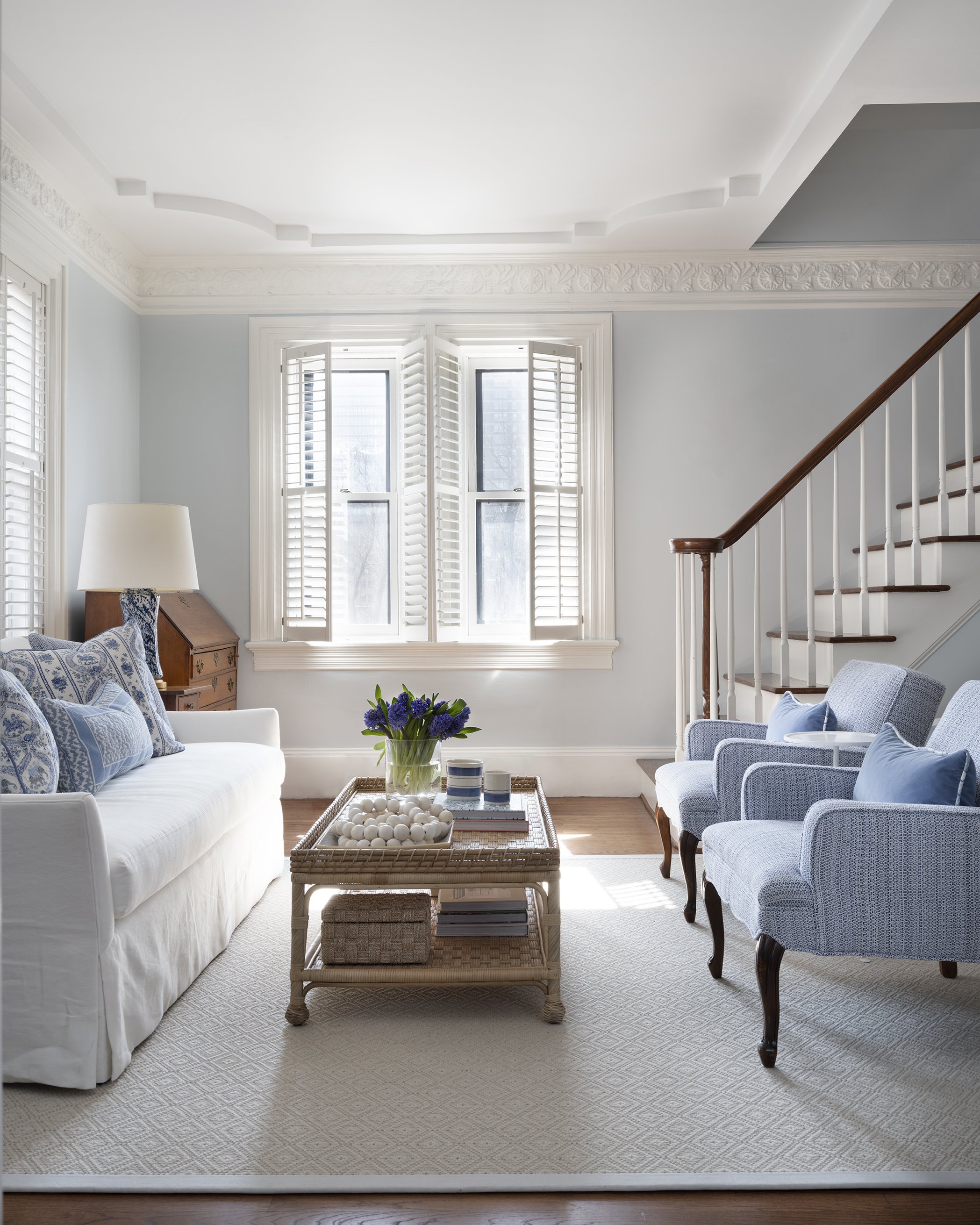
Our client reached out with the goal to brighten her Back Bay living room in “The Coolidge House.”
The house was built in 1880 - 1881 for iron and steel manufacturer, George Parsons King. Architect, William Whitney Lewis designed the home and it was featured in great detail in the July 23, 1882 Boston Sunday Globe. After several different owners, the property was transformed into a lodging house in 1940, called "The Duchess House.” In the late 1970's the residence was divided into six condominiums, which remain in use today. Here is an architectural rendering from 1881:
During our preliminary meeting, we established the need for a custom area rug to better fit the space. We also emphasized the need for furniture that was appropriate for the scale of the room. Our client requested that the design reference her home on Martha’s Vineyard. She wanted to walk into an airy, welcoming, and uplifting living room filled with blue and white. Here is a look at the before:
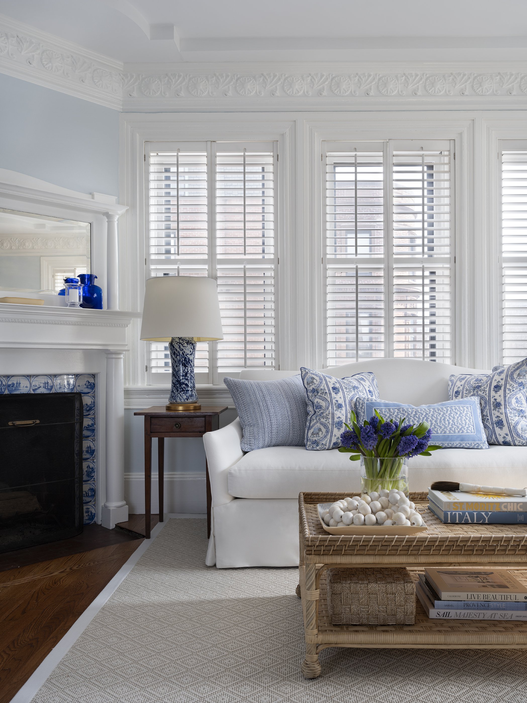
The original fireplace served as great inspiration for the design. Here is a photo and our presentation mood board:
Two family chairs were to be reupholstered in a blue and white woven fabric. The paint was tweaked from a light blue with subtle aqua, to a soft blue, with a hint of periwinkle. A sofa with a curved back was selected to interrupt the linear lines of the windows and shutters, but also mimic the curved details of the tray ceiling. We also incorporated a woven coffee table for texture. And splatter table lamps were added on either side of the sofa for balanced symmetry and lighting during darker hours.
Details on the history of the building were gathered from Back Bay Houses and Boston Sunday Globe. Final project photography by Sarah Winchester Studios.


